

They say that in Amazon, SEO is for the algorithm bots, and images are for the humans. Creating high-quality Amazon product photos is one of the most overlooked but impactful strategies to drive sales and build trust with potential buyers.
If you ask me, I agree 100%. This step-by-step tutorial is perfect for beginners looking to create high-quality product images for their amazon fba listings.
When you’re shopping on Amazon, you likely never read the Bullet Points on a product page and aren’t even aware that a description for products exists. That’s why product photos are key to grabbing attention and driving amazon sales on your detail page.
Therefore, it’s not a stretch to believe that your images are one of, if not the biggest factor to influencing your conversion rates (aside from price). Nailing your amazon product photography can seriously pump up those conversion rates and help your amazon business thrive.
In this post, we’ll go over the 2 types of images (main image and alternative images) and how to make them appear high quality, unique, and valuable to potential customers. Let’s dive into photography tips to make your product listings pop and build trust with shoppers.
Product Main Image – The KEY To Conversions
I can’t overstate how vital your main product image is.
Aside from lowering your price, I don’t think there’s anything else you can adjust on your product listing that has a greater impact on potential sales and conversions than the main image.
Two reasons:
- It’s the first way potential buyers interact with your product.
- It’s how you stand out from the competition.
Everything else, product title, bullet points, descriptions, while being important don’t have that same impact as your main image.
The quality of images has been steadily increasing on Amazon as the platform gets more popular and competitive with each passing year, but there's still a lot of ground to be made for new and budding sellers.
How to Construct a Perfect Main Image
1 - Follow Amazon’s Technical Guidelines
Having the wrong filename or file type is a terrible reason for your images to not show up or even have your listing potentially taken down.
Amazon has clear technical guidelines for main product images. You can find them on their Product Image Requirements page for the Main image.
Technical requirements are as follows:
- TIFF (.tif/.tiff), JPEG (.jpeg/.jpg), GIF (.gif) and PNG (.png) format
- Image pixel dimensions of at least 1000 or larger in either height or width preferred
- sRGB or CMYK color mode
- File names must consist of the product identifier (Amazon ASIN, 13-digit ISBN, EAN, JAN, or UPC) followed by a period and the appropriate file extension (Example: B000123456.jpg or 0237425673485.tif)
- No special characters in the file name (spaces, dashes, or additional characters)
These are pretty straightforward and easy to do. The one on image pixel dimensions is lacking clarity, so let’s nail that one down.
2 - Your Image Should Be a 2,000 x 2,000 Pixel Square
While Amazon says your images should be at least 1000 pixels, they don’t say what the exact optimal number of pixels your images should be. A 2,000 x 2,000 pixels square is the sweet spot for high-quality images that zoom in perfectly.
Something to keep in mind, Amazon has a zoom feature for product images when a customer hovers over them with their mouse. Zoomable images let customers check out product details up close, boosting trust.
The amount of zoom depends on the size of your image:
- 1-499 pixels: Your image will not upload to Amazon
- 500-999 pixels: Your image will not have any zoom
- 1000-1599 pixels: Sub-optimal zoom
- 1600+ pixels: Optimal zoom (will zoom in closest on products)
Amazon claims that 1600px on every side is the optimal number for maximum zoom, the selling community believes that 2,000 pixels is the magic number, as it guarantees optimal zoom, a large image, and doesn’t make the file size too large.
Going too large, like 4,000 pixels, will not affect zoom anymore than a 2,000 pixel image will.
In terms of image shape, a square is the optimal shape for all images.
Amazon is designed around images being squares.
If your image is not a square, Amazon will crop it to make it a square and the white space they add will be unusable.
3 - Your Image Should Have a White Background
While this one is obvious, a lot of sellers to this day will upload main images that don’t use a white background. A white background is non-negotiable for your main image to meet Amazon’s rules.
Skipping the white background risks your amazon fba listing getting pulled without warning.
And just to be clear, the background should be white. Pure white is the only way to go for amazon product images.
Not off-white, light gray, eggshell white, only white-white (RGB value of 255, 255, 255).
Not adhering to this can get your listing taken down, or worse removed from search results with no warning or notification from Amazon.
One less often talked about problem brought on by suboptimal images is that your listing is weaker to malicious attacks. An image without a white background can be replaced by anyone with something completely different than what your product actually is, leading to all kinds of problems.
Moral of the story? Don’t mess with the white-background rule.
4 - Fill in as Much Empty Image Space as Possible
Since Amazon restricts you to square images, and a lot of products aren’t square shaped, you have to figure out how to fill that white space.
“But my product isn’t square at any angle! I can’t utilize all the space!” I hear you saying.
I’m here to tell you there’s always a way, and a lot of sellers utilize different techniques to fill up that space.
Let’s look at the example of refillable water bottles.
The brand IronFlask has done some pretty creative things to fill up that white space for their main image, let’s take a look at one of their products:
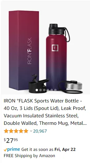
They include the bottle itself, sprinkle some extra tops that come with the bottle, and include their matching packaging which serves a lot of purposes:
- It fills up unused white space
- Shows off extra goodies that come with the product (strong differentiator in a niche where all products are nearly identical)
- Show off their specially designed packaging which makes it a good gift and strengthens their branding.
What you end up with is a great example of a main image that sticks out among other water bottle offerings, and in turn nets them a bunch of sales.
So when you’re trying to fill in white space, get creative. Don’t be afraid to play a little fast and loose with Amazon’s standards. If you’re not technically breaking any rules, then you won’t get punished.
Some ideas to fill in the white space of your Main Image:
- Show off your packaging if it’s decorative or even functional
- Include any extra items that come packaged with your product
- You can sometimes add a bit of decoration if it makes sense (tread carefully here!)
- Find an angle that allows your product to fill in the square better (sometimes picking an angle that is unique to competitor offerings could allow your image to stand out)
5 - Add Value Without Breaking Rules
Amazon has rules, standards and guidelines for their images, however they make the language around a lot of it vague to give sellers a bit of wiggle room to get creative.
As long as you’re not explicitly breaking the rules, there’s a lot you can get away with on your Main product image.
This is an opportunity to convey the value of your product to potential customers without explicitly breaking any rules.
Let’s see Amazon’s standards for Main Images and see how sellers tiptoe around them to deliver value to customers:
Product Packaging in Main Image
What Amazon says you should do: MAIN images must show products outside of their packaging. Boxes, bags, or cases should not appear in the image unless they are an important product feature.
What smart sellers actually do: “Important product feature” is an extremely subjective and vague line. Iron Flask in our previous example on white space shows off their color matching packaging, which can qualify as something “important”
If it makes sense and can convey the value of your product to customers, then include the outside packaging on your main image.
Use 3D Renders instead of Photographs
What Amazon says you should do: MAIN images must be professional photographs of the actual product (graphics, illustrations, mockups, or placeholders are not allowed). They must not show excluded accessories or props that might confuse the customer.
What smart sellers actually do: While an obvious drawing of your product won’t work, 3D Renders are so convincing these days that no one will be able to tell the difference.

The future of eCommerce products is in 3D renders.
Not only can a 3D render images look better than even a professional photoshoot, they can be cheaper, too.
Your product can even be inserted into stock photos so seamlessly these days that you can launch an entire product line and never need to hire a photographer.

How to include text in your main image
What Amazon says you should do: MAIN images must not include text, logos, borders, color blocks, watermarks, or other graphics over the top of a product or in the background.
What smart sellers actually do: You can’t put text in your product’s main image, but you can’t help it if a picture of your main product happens to contain some text about the product.
See? Nothing wrong here, just a picture of the actual product.

Okay this example might be a bit gratuitous, but hey, they are getting away with it.
6 - Main Image Examples: Bad, Better, Best
Let’s look at some main images in a very competitive space: Coffee.
Now these are just my opinion on examples of existing products on Amazon, but I’ll go over why I like one over another.
Example 1 - A Bad Main Image

This pour-over coffee maker has a simple main image, let’s go over what it does right and wrong.
What I do like:
- The picture shows the product in action.
- Image includes filters that come with it.
What I don’t like:
- The filters are weirdly floating in the top right corner.
- The product picture isn’t appealing. The colors seem washed out, it appears blurry, and even though it’s in action it’s not attractive.
Example 2 - A Better Main Image

This product does a lot right that the previous image doesn’t, but still has some questionable choices.
What I like about this:
- It fills up almost all the available white space
- The image itself is clean
- There’s a lot of extra bonus items that come with it (spoon and wood platform)
- Includes the product packaging
- The image isn’t blurry
What I don’t like:
- While it includes product packaging… It's ugly packaging. Also the box only shows the image of the product right in front of it!
- The filter is weirdly full of brewing coffee. Anyone who makes coffee knows that it looks off and coffee would be spilling everywhere.
- The coffee beans in front, while they do a nice job of filling space and adding flair, have some strange plastic looking green leaves.
- There's extra coffee beans extending into the border, which could get it dinged by Amazon.
- While the extra goodies are nice, they’re not particularly useful.
So this main image does a lot right, but misses the mark on execution.
Example 3 - A Great Main Image
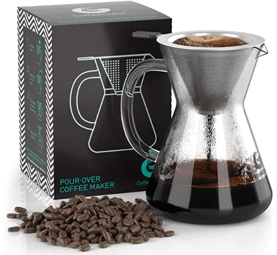
This is another pour-over coffee maker that does a lot of what the others do, just better.
What I like:
- There’s very little white space that isn't filled.
- The product packaging is included, but it has a great design, color choice, a cool pattern, and shows off the uniqueness of the brand.
- The product is in action and looks appealing.
- The coffee beans add some flair, and don’t extend to the edges of the picture.
- Nothing is floating weirdly, it’s all part of one set piece on one flat platform.
What I don’t like:
- Maybe the coffee beans themselves could look a bit more appealing.
I can’t say enough good things about this main image. They really nailed it and they keep this style in their images consistent across their entire product line.
Alternative Images - What To Do
Your alternative images are any pictures that come after the Main Image.

There are far fewer restrictions with alternative images compared to your main image.
Instead of getting bogged down with technical details, let’s go over what makes for good alternative images.
1 - Consistent Branding, Style, and Coloring
Your branding is one of the only ways to stick out on Amazon, and this will be more apparent as more businesses enter the platform.
Your branding is anything visual. Things like your logo, color scheme, and overall tone you set for your products.
A little bit of color goes a long way.

Let's see another example:
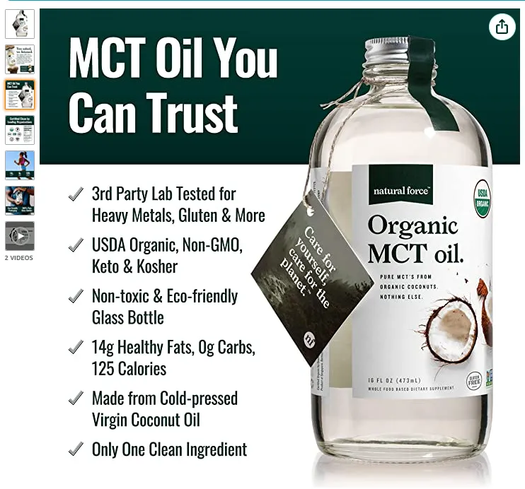
This MCT oil does a lot of branding right:
- Consistent green/white color scheme across all images
- Eco-friendly details everywhere, from the tag on the bottle to the packaging
- Organic certified
- Health and fitness focused
2 - Lifestyle Images
If you don’t know what lifestyle images are, they are the images on your listing that show real people showcasing your product in action.
Lifestyle images are powerful conversion tools, especially when they properly match the use-case for your product, capture the target audience accurately, and look believable.

Do your lifestyle images right. If you can’t, then don’t include them until you can do it right.
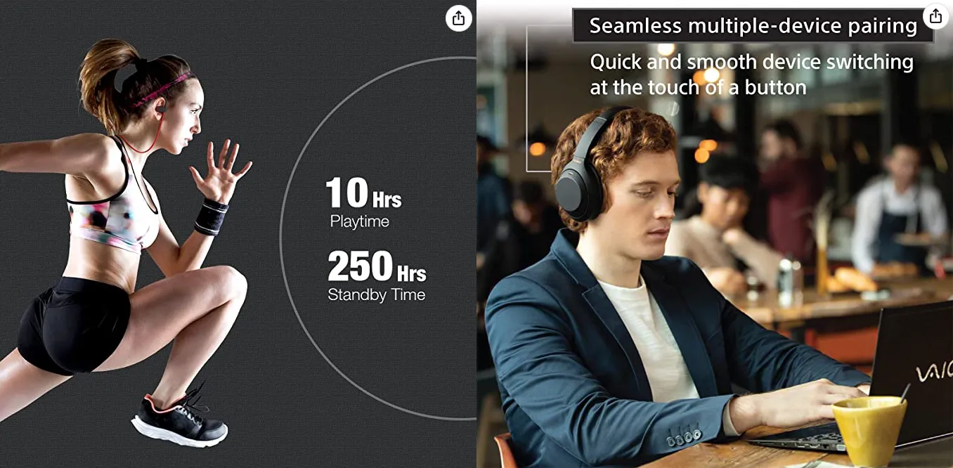
3 - Infographics
You know what an infographic is, right?
If not, an infographic lists stats about your product but presents it in a visual artistic way.

This (almost) great infographic shows off different stats about their insulated cup and presents it in an appealing way. If only they caught that spelling error. Oops!
4 - Highlight What’s Most Important
To make it on Amazon these days, you must be innovating and improving upon what already exists, or your product will be dead on arrival.
Once you have innovated and created a product, it’s your job to let people know about it.
Use your images as your weapon to let potential customers know what makes your product more unique, better designed, more environmentally conscious, more effective, etc.

Things that make your product unique:
- Materials used. Wood/metal/leather over plastic, for example.
- Product capabilities. Lasts longer, has more units, sturdier.
- Use-cases it excels in. Fitness related? Works outdoors?
- What’s included. Items that include extra complimentary accessories can do very well.
- Aspects of exceptional quality. Reinforced where other products are weak, hand-made features, etc.
- Who it is designed for. Made for professionals, suitable for children, rugged design for men, etc.
No one knows your product and why it was made better than you.
Let your potential customers know why they should make a purchase in your alternative images.
Conclusion
With the information in this guide, you should be able to make product images that are better than 90% of what’s currently on Amazon. Remember, never explicitly break rules that will cause your listing to get taken down, but at the same time realize some rules aren’t really rules at all but guidelines you can stray a bit away from so that your images have a way to stand out. High-quality product photos can drastically increase your conversion rates, giving your Amazon listing the edge it needs to dominate search results. By following proper lighting techniques, using natural light or softboxes, and focusing on high-resolution product images, you create a visual story that sells. Don’t overlook the power of close-up shots, infographics, and consistent branding—these are the product photography tips that turn potential customers into actual buyers. Whether you're an Amazon seller using a DSLR camera or experimenting with artificial light in a DIY setup, optimizing your product photography is non-negotiable. Professional-looking Amazon product photos do more than follow Amazon’s guidelines—they build trust, boost your product page engagement, and drive sales. From seller central to your online store and even your social media ads, strong product images translate into real ecommerce success.
